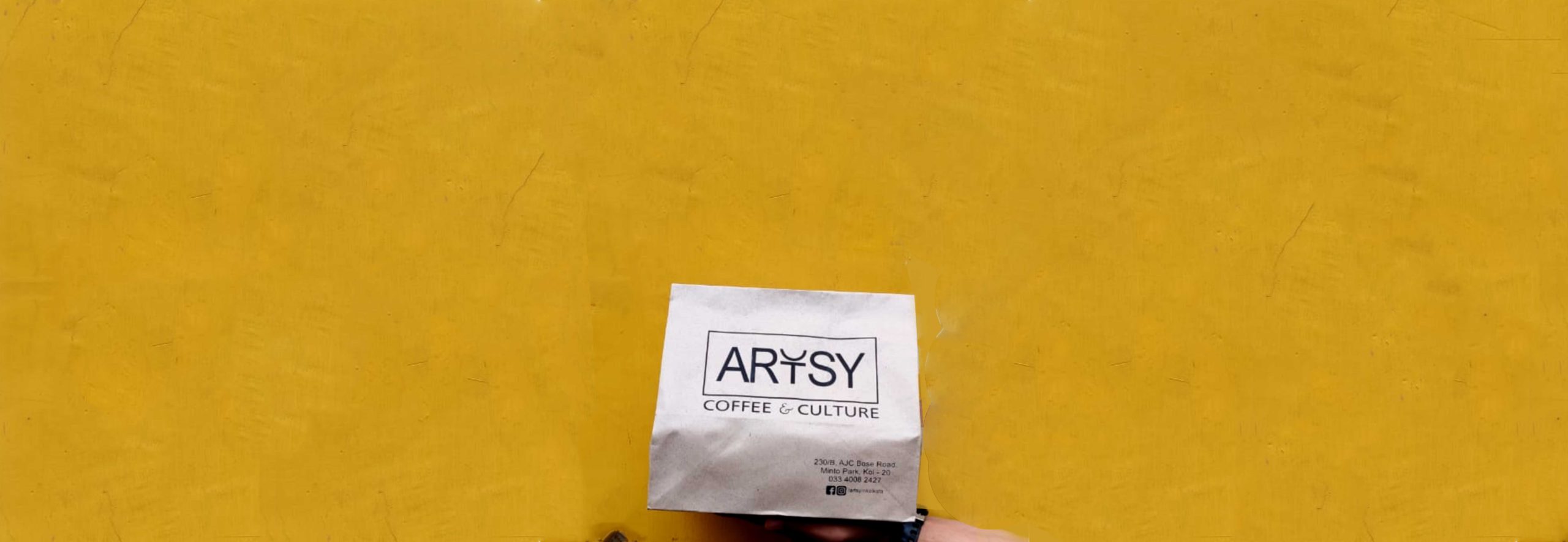
Client: Artsy – Coffee & Culture
The city of Kolkata seemed to be dwindling into a less interesting version of its past self with many other cities now playing host to most cultural soirees. A major reason for this trend started with the younger intellectual generations from across the country converging at the major hubs. We found that a lot of Kolkata is living and working elsewhere, leaving the city rather uninitiated on the cultural front.
The team at Artsy decided to dust off those old shelves and pick up that ignored cultural heritage and channel it into the cafe (and quite successfully, they just completed their 3rd Birthday amidst much aplomb). Artsy is one of the projects where we collaborated with our associates at TRBC, who took care of the architectural requirements. Immediately both teams found great synergy with each other and the concept. It was also so idealistic – the erstwhile cultural capital of the country birthing a cafe that wished to support multiple art forms. We may even go as far as to call such a project a paradise of creativity.
For Artsy we did it all – Naming, Identity, Design, Visualisations and Social Media. We work with them across and through their journey. We worked closely with the Founding team to find inspiration in their conviction to resurrect and place Artsy at the centre of both the cafe scene and art scene. These bold claims invigorated both the design and architecture team to create a cafe experience unique across the entire country (if not world) and embody the spirit of the city through each miniscule detail.

The Artsy logo and identity was made to allow an eyebrow raising curiosity amongst the audience. All of whom wondered and guessed what it could possibly symbolize, while the Artsy branding was minimal and symmetrical, it had room for enthralling people. The good people at TRBC found themselves also uniquely intrigued by this identity and envisioned the space with similar symmetry and clean lines. Their initial research regarding the colours of Calcutta was spot on – the mango and teal captured the city perfectly. Our approach dove-tailed from here, we took these colours and ran with them, blending them with our monochromatic identity.


Artsy stood for much more than just a space with good coffee. It was to be a change-maker in the city, a first of its kind space that merges the worlds of gastronomy, coffee, and art. We anointed it with its tagline Coffee & Culture. The brand with its beautiful space immediately began to take on a life of its own. While we may be managing the communications and outreach for the brand, we inform our designs and aesthetic on our patrons. Through our communications we equivocate the idea that Artsy is a patron-driven brand, it exists for the city of Calcutta and its lovely samaritans. All that we put out there on behalf of the Management constantly reflects the promise such a bold venture makes to the city it resides in. They promise to uphold the cultural integrity of Calcutta through whatever they do.