The struggling arts and crafts industry in India is seeing a resurgence like never before. We owe this to the brave artisans who believed in their craft and ambitious entrepreneurs who decided to take our crafts to the world.
We share with you an account of our learnings from building the new digital experience for itokri.com – propelling arts and crafts to greater heights.
For over 10 years now, Nitin and Jia (the wonderful people behind itokri) have been enabling artisans to sell their crafts through the itokri platform. According to the duo, it has been a challenging journey yet very much worth the effort. Appropriately reflected through the love they get from their extremely loyal patrons across the globe, yes, you read that correctly – 50+ countries.
After surviving the pandemic and supporting their artisans in every way possible, the team at itokri decided to take their platform to the next level. This was our cue. Just off our peesafe.com build, we were eager to surf on the bigger waves.
At the outset, we evaluated every aspect of itokri to recommend the following interventions – rebranded visual identity, communication design, and UI/UX design. What followed was beyond any scope of work. It was a labour of love.
Itokri’s identity proved deeply embedded in the minds of its customers. The artsy aesthetic with a bright yellow colour led to an association that regardless of design finesse, invoked a nostalgic connection.
Through multiple iterations, we narrowed down our concept to addressing the elephant in the room – what really was the relevance of the tokri. We chose to continue with the tone of colour while creating a signature logo that was soft and feminine, instead of the sharper and saturated current version. The tokri was to play the role of the much-needed monogram to provide recognition to the brand.
We ingrained the values developed over ten years of itokri’s existence into its identity and story, leading to more wholesome visual branding. Here’s a snippet from the brand story and logo inference:

The origin of craft, specifically Indian craft is the story of culture, community, and creativity. The vast talent represented by our artisans has stood the test of time, complimenting our lives through all occasions.
At itokri, we recognise and respect the commitment it takes to create art and craft – woven, stitched, hammered, painted – created by hand for every piece that is produced.
We have a humble mission – to take art and craft to every household in India, and beyond. To encourage people to realise the value of handmade, sustainable, earth-friendly crafts. Adorned in everyday life with a smile.
Crafts for everyday life.

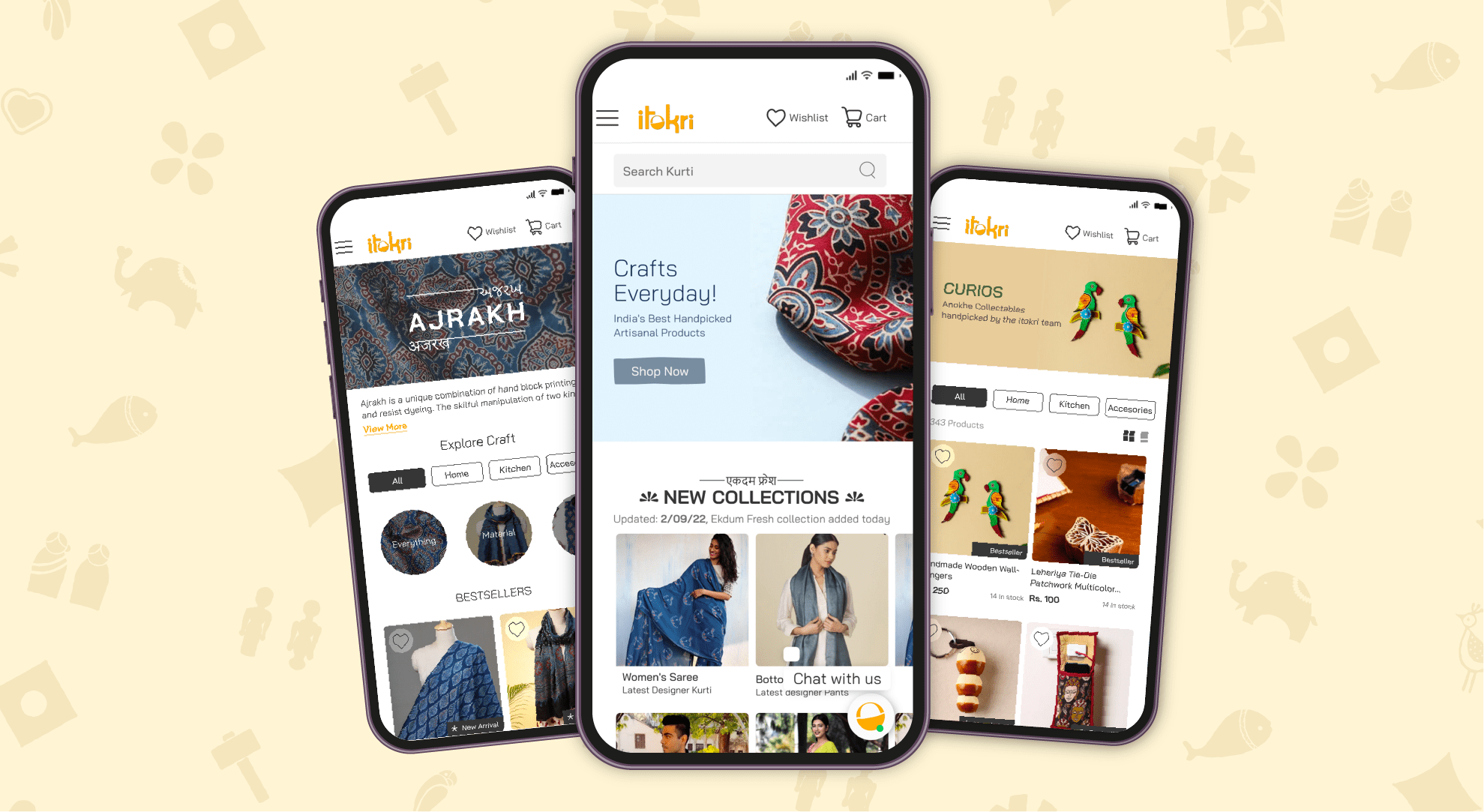
Using our ReDID methodology, we began to extensively map out customer personas and decision workflows to enhance user experiences. Itokri with its 200+ crafts, 500 artisans, 20 States of India, and 1 lac+ product listings challenged us to go deeper and further than we ever had before.
We set competitor benchmarks, uncovered insights into the craft lover’s mindset, and mapped every possible journey a user could take. We presented our ideas and UX solution through a wireframe. We were confident that primarily 4 customer journeys would encapsulate all possible methods of discovery.
Search, Sort, Scroll and Click were our journey starting points.
Here’s the flow below.

Given the depth required for a user to have an optimal experience, we decided to build a simple design system to ensure usability across all ages and digital literacy levels. Mindful that itokri’s key persona is above 50 years of age.
In the age of storytelling and content-driven marketing, we sprinkled nuggets of information across the website in the unique design language developed as part of the itokri communication design. This brought forth a semblance of uniformity to the overall user experience beyond the visual interface. As a key initiative, we honed in on itokri’s efforts to educate and popularise these diverse craft forms amongst people from across India. We ensured our solution incorporated entire journeys that informed a customer about the product as well as included bite-sized content across the catalogue pages. Some interesting journeys you could take on the product today are:
Explore by Region – Dunes of Rajasthan, Eastern Flavour, Seven Sisters and more. Featured Artisans – Artisans of the Month with premium home page placement.
Discover Craft Forms – Ajrakh, Batik, Bastar Wrought Iron, Jaipur Blue Pottery, the discovery is endless.
Planned Curations – Best of Everything, Curios, itokri picks, seasonal sales, journeys that allow smaller product catalogues to be enjoyed with relevance.

To conclude, the critical intervention which helped us build itokri with unwavering attention to detail was communication design. It is the connective tissue between the identity and UI design, integrating all that we want to present in an endearing way – reflecting the best of what itokri stands for. Here are some examples of the same.